Archive for October, 2004

Business Card Final

Ok, so the “Business Card Project” is dead and burried.

I’m glad to say that not only did I end up with an A(I’m a nerd), I also got the highest average. I decided to share because some of you were really nice and helped, and because I promised Sami to show him 2 weeks ago but forgot all about it.

The right colors are on the front, the back is actually the same color in real life but it looks different here cause I didn’t use flash. Of course, it’s also straight, it looks like this because again, I didn’t balance my camera. Oh, well. You guys can deal.

Front of Business Card:
Pictures 629

Back of Business Card:
Pictures 630

Ok, and here’s the concept and how I worked out everything if anyone is interested(or bored enough) in reading:

Identity Name and Slogan: The name, which is “Box”, goes hand in hand with the slogan, “Think Outside”.

Idea Concept:

“Think Outside the Box”

Thinking outside the box means thinking beyond the limitations of human consciousness and familiarity; to see past the standard. It’s a phrase that signifies creativity and resourcefulness, which is why I coined my identity name from it.
A box is also a very important shape in the world of arts and design. Rooms are boxes, websites are boxes one way or another and the shape box is used in almost all fields of art and design.

Design Concept:
My concept when it comes to the idea lays in a comparison between ordinariness and uniqueness. The elements I used in the card are contrasting:

1) The logo, the square logo at the side of the card, represents rigidity. It also symbolizes the word box, and signifies the physical world. The circle at the other side represents a creative idea that is outside the box. It corresponds to unity, wholeness, and infinity. Thus, it is the driving force of the physical world (the box).
2) The logo is static. It doesn’t change and stays at the same place at all times. The circle and the repetitive “ThinkOutside” slogan are dynamic. They move around the card according to mood and feel.

Layout:

1) The logo not only reads box, but it also looks very boxy, so that it serves as a pictorial, symbolic, and typographic logo at the same time. In the second design, the hollowed out slogan allows you to literally see outside the box.
2) Recurring “Think Outside” bordering the logo, to emphasize importance of slogan.
3) The logo contains sharp lines in order to signify the sharpness and keen of mind.
4) Colors: I chose red because of the phrase “Red carpet treatment” (make someone feel special, treat them as if they are a celebrity). Red also suggests confidence and power, hence the red power tie for business people and the red carpet for celebrities and VIPs.
Furthermore, red grabs attention and makes people take action.
Pink was added to calm down the effects of red.
5) If an imaginary line was drawn down the center of the logo, it would run down the golden section.
6) In the second design, the logo would still read box if it was flipped.

I was trying to be deep :P

Comments (1)

Infamous Monsters of Filmland

You decide: who is REALLY scary? Face it: the so-called “Famous Monsters of Filmland” may have scared us as children, but they were mostly misunderstood creatures who weren’t malicious or intentionally monstrous. Now, however, we are forced to confront real-life monsters who will truly make it difficult to get to sleep.
Check out the amazing comparisions at http://korlapundit.blogspot.com/2004/10/infamous-monsters-of-filmland.html

Comments

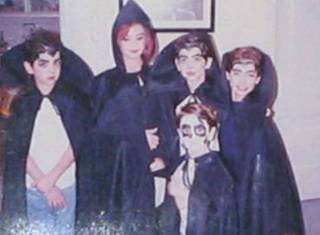
Haloween Monsters

This is me, my three brothers, and friend on Haloween a long, long, long time ago. I cracked up when I saw it a few days ago and I had to share.
Darn, I can still see all the candy we gathered that day…

Comments

A Bibliophiles Bedroom

Building With Books began in 2004 in MIT, and is currently on display at the Boston Public Library in Defferrari Hall. I love it. It’s such a cool idea, and the way they put things together is even cooler. My favorite is the bed.


Room Overview


Bed


Rocking Chair


Bedside Table


Lamp


Frame


Umbrella Stand

Check out the other cool stuff and bigger pictures here.

Comments

Fear, I’m crippled

It’s all over the news, NASA picked May 2005 for launch date, the first launch since the Columbia tragedy two years ago.
Scary. I’m glad I’m not the boss at NASA. I wouldn’t have even considered relaunching after a tragedy like Columbia for at least 10 years. I’m too cautious.
This makes me think of how fear and evolvement go hand in hand. If the NASA people don’t relaunch, we won’t evolve.
So does my fear cripple my life and evolvement? I think it does. I’m too much of a perfectionist, always afraid of screwing something in my perfectly planned out life. Everything in my life has to be perfect or I’ll get depressed. I need to be literally pushed into taking a step sometimes, and that only happens after calculations, re-calculations and schemes drawn up in my mind. I’m really much too afraid of failure and rejection.
….
Once again, I’m glad I don’t work for NASA.

Comments

The New Crowd

I thought this picture was pretty cool. Check out the rest of the pictures at bsimple.com.

Comments

The New Uses of The Internet

Haitham was telling me about this so I decided to research it and check it out:

“Internet users are doing far fewer searches for sex and pornography and more for e-commerce and business than they were seven years ago, University of Pittsburgh and Penn State researchers say in a new book. “Twenty percent of all searching was sex-related back in 1997; now it’s about 5 percent,” said Amanda Spink, the University of Pittsburgh professor who co-authored Web Search: Public Searching of the Web with Penn State professor Bernard J. Jansen. “It’s a little bit more in Europe, 8 to 10 percent, but in comparison to everything else, it’s a very small percent,” Spink said. “People are using (the web) more as an everyday tool rather than as just an entertainment medium.” What hasn’t changed much in seven years is how hard people are willing to work at searching. The answer: not very. Spink and Jansen found that people averaged about two words per query and two queries per search session.”

[Via Agenda Inc.]

Very good! I see that people are finally starting to see the useful side of things.

Comments

Today’s Garbage

“Not quite as hot as that original iMac someone tossed out, but it’s amazing what turns up on the sidewalk here in New York.”

[Via Engadget]

Comments

AraBlog ReBlogger

I’m very pleased that Haitham has decided to select me as the first guest reBlogger at AraBlog. Haitham, I really hope I’ll be able to enrich AraBlog like you hope, and I’m sure I will enjoy it immensely!

Comments

Book Cover Design

Our first project for the year was done last week, I submitted the “Business Card Project” last Sunday. I think my business card turned out alright, but I would have done a better job if I had more time. I’ll post pictures later.
Our next project is book cover design, which should be more interesting than business cards especially with my obsession with books. I had a really hard time choosing the book(I had too many ideas, including Ameen Malouf’s Samarkand, and Anne Rice’s Pandora. In the end, I settled for a very ugly design book by Judith Miller called Color.

The reason I chose it is because I’m amazed at the fact that a lady who is trying to teach people how to use colors in their designs uses such disgusting colors in her book cover. It’s too bright for one thing and the main colors are more suitable for a childrens picture book. The photographs displayed also contrast in an extreme way with the background color and the typography. Unbelievable.
Hehe, damn it, she’s trying to teach people how to use color!!!
There are a lot of amazing book covers around, and I’ve had several posts about that. One of my favorites is Memoirs of a Geisha’s cover(also one of my favorite books, its a must-read).

Beautiful right? It’s a work of art.
If anyone knows any amazing or horrifying book covers, please do share, because we’re expected to do case studies and all.

Comments (1)

Previous Page